
Accordion
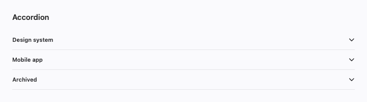
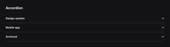
Native accordion composition, package imports, and editable Swift source.
Preview
Use it
Import SwiftCN to use CNAccordion directly. This complete example also runs in the native component gallery.
import SwiftUI
import SwiftCN

struct AccordionExample: View {
    @State private var expanded: Set<String> = []
    private let options = [CNOption("design", title: "Design system"), CNOption("mobile", title: "Mobile app"), CNOption("archive", title: "Archived", isDisabled: true)]

    var body: some View {
        VStack(alignment: .leading, spacing: 12) {
            CNAccordion(options, expanded: $expanded, mode: .single) { option in
                Text("Native disclosure content for \(option.title). ").tw("text-sm text-mutedForeground")
            } label: { option in Text(option.title) }

        }
    }
}
Native behavior
Stable caller-owned IDs preserve expansion through reorder. Choose single or multiple expansion. A custom native DisclosureGroup style makes the complete header, including whitespace and the chevron, one native Button. Collapsed content unmounts by default. Set keepContentMounted: true to retain child state. Mounted hidden controls cannot receive input or accessibility focus; their tasks continue until the host removes them.
Style and compose
Visual recipes use .tw classes. Append classes: to override a recipe locally, or change the recipe in TWGlobalRules.named for your subtree. Native layout and interaction modifiers remain SwiftUI APIs. For control colors, append cn-tint-[primary], another theme token, or an interpolated Color.
Motion recipes are editable too: control-motion uses a 150 ms smooth response, disclosure-motion uses a 250 ms spring, and feedback-motion uses a 200 ms smooth response. Set a recipe to animate-none in your global rules to turn it off. Presets respect Reduce Motion. Static components stay still; native scrolling, drag tracking, and platform presentation keep their own gestures.
Action groups and card, dialog, and questionnaire footers stack when their content does not fit. The native layout preserves the same child controls during this change.
View builders preserve native child content. Native Button roles, labels, keyboard shortcuts, submit actions, and presentation modifiers still work. A string recipe does not replace a native control API or a typed chart mark.
Own the source
Copy the complete file below into your app alongside import SwiftCN. The file contains related composable parts from the same family. Its dependencies use public package APIs, so copied and imported components can coexist.
To own the styling engine too, download the complete source bundle. It contains every component, the .tw engine, its recipes, and the MIT license. Keep those files in one module and remove import SwiftCN from the usage example.
import SwiftUI
import SwiftCN

public struct CNCollapsible<Label: View, Content: View>: View {
    @Binding private var isExpanded: Bool
    private let classes: TWClasses
    private let keepContentMounted: Bool
    private let label: Label
    private let content: Content
    /// Retain child state when collapsed. Hidden content stays mounted, including its tasks.
    public init(isExpanded: Binding<Bool>, classes: TWClasses = "", keepContentMounted: Bool = false, @ViewBuilder content: () -> Content,
                @ViewBuilder label: () -> Label) {
        _isExpanded = isExpanded; self.classes = classes; self.keepContentMounted = keepContentMounted
        self.content = content(); self.label = label()
    }
    public var body: some View {
        DisclosureGroup(isExpanded: $isExpanded) { content } label: { label }
            .disclosureGroupStyle(CNDisclosureGroupStyle(keepContentMounted: keepContentMounted))
            .tw(cn("collapsible disclosure-motion", classes), value: isExpanded, animationScope: .layout)
    }
}

public enum CNAccordionMode: Sendable { case single, multiple }
/// IDs belong to the caller. Reordering items does not change which disclosure is open.
public struct CNAccordion<Data: RandomAccessCollection, Label: View, Content: View>: View where Data.Element: Identifiable {
    private let data: Data
    @Binding private var expanded: Set<Data.Element.ID>
    private let mode: CNAccordionMode
    private let keepContentMounted: Bool
    private let classes: TWClasses
    private let label: (Data.Element) -> Label
    private let content: (Data.Element) -> Content
    public init(_ data: Data, expanded: Binding<Set<Data.Element.ID>>, mode: CNAccordionMode = .multiple,
                classes: TWClasses = "", keepContentMounted: Bool = false, @ViewBuilder content: @escaping (Data.Element) -> Content,
                @ViewBuilder label: @escaping (Data.Element) -> Label) {
        self.data = data; _expanded = expanded; self.mode = mode; self.classes = classes; self.keepContentMounted = keepContentMounted
        self.label = label; self.content = content
    }
    public var body: some View {
        VStack(alignment: .leading, spacing: 0) {
            ForEach(data) { item in
                DisclosureGroup(isExpanded: Binding(get: { expanded.contains(item.id) }, set: { open in
                    if open { if mode == .single { expanded = [item.id] } else { expanded.insert(item.id) } }
                    else { expanded.remove(item.id) }
                })) { content(item) } label: { label(item) }
                    .disclosureGroupStyle(CNDisclosureGroupStyle(classes: "accordion-item w-full px-0 rounded-none", keepContentMounted: keepContentMounted))
                CNSeparator()
            }
        }.tw(cn("accordion disclosure-motion", classes), value: expanded, animationScope: .layout)
    }
}

/// The whole header is a native Button, including its whitespace and disclosure indicator.
public struct CNDisclosureGroupStyle: DisclosureGroupStyle {
    private let classes: TWClasses
    private let keepContentMounted: Bool
    public init(classes: TWClasses = "w-full px-0 py-2 rounded-none", keepContentMounted: Bool = false) {
        self.classes = classes; self.keepContentMounted = keepContentMounted
    }
    public func makeBody(configuration: Configuration) -> some View {
        VStack(alignment: .leading, spacing: 0) {
            CNButton(variant: .ghost, classes: classes, action: { configuration.isExpanded.toggle() }) {
                HStack(spacing: 12) {
                    configuration.label
                    Spacer(minLength: 0)
                    Image(systemName: "chevron.down").rotationEffect(.degrees(configuration.isExpanded ? 180 : 0))
                        .accessibilityHidden(true)
                }
            }.accessibilityValue(configuration.isExpanded ? Text("Expanded") : Text("Collapsed"))
            if keepContentMounted {
                configuration.content
                    .frame(height: configuration.isExpanded ? nil : 0, alignment: .top)
                    .opacity(configuration.isExpanded ? 1 : 0).clipped()
                    .disabled(!configuration.isExpanded)
                    .allowsHitTesting(configuration.isExpanded)
                    .accessibilityHidden(!configuration.isExpanded)
            } else if configuration.isExpanded { configuration.content }
        }
    }
}